React Native
Links
React Native Vs Expo
- React Native is an open-source mobile application framework created by Facebook for building applications for iOS and Android platforms
- Expo is a tool that enables developers to build and deploy applications using the React Native framework.
- Expo is built on top of React Native and provides a set of APIs for making it easier to interact with device capabilities like the camera, accelerometer, and more, as well as a command-line tool to simplify the process of building, testing, and deploying your React Native application.
- Expo is the recommend way to build react native applications
Create to Release
Create
npx create-expo-app@latest

#remove expo examples
npm run reset-project
Run on
- Set up your environment - Expo Documentation
- Expo go
- what?
- a mobile app you have to install
- Simple testing and non production app development
- great when you're getting started on a project or for prototypes.
- Command
npx expo startand then scan the QR code
- what?
- Simulator or Emulator
- For developing apps meant for production apps
- provide a more flexible, reliable, and complete development environment.
- Command
- make sure to install
npx expo install expo-dev-client
npx expo run
- make sure to install
- For developing apps meant for production apps
- Physical device
- For developing or testing apps meant for production apps
- This is great when testing features that require physical devices such as camera and haptic.
- Command
- make sure to install
npx expo install expo-dev-client
npx expo run
- make sure to install
- For developing or testing apps meant for production apps
Add New Library
- Different Development Stages
- First, Install a new library
npx expo install package-name- Do not use
npm(yarn) install package-name, because these do not allow Expo CLI to pick a compatible version of a library when possible and warn you about known incompatibilities.
- Do not use
- Then, Does the library include native code?
- How to know if the library has native code
- yes
- Stop and pre-build the app
npx expo prebuild --clean - Run the dev server to continue
npx expo run
- Stop and pre-build the app
- no
- See the changes immediately or reload the app by pressing
rin terminal - if this doesn't work
- Close the app and run it again
- See the changes immediately or reload the app by pressing
Production Builds
- When to use Production builds
- To build the final release app that you intend to release to app store or Google Play Store
- Checklists before submission
- Before building a release app, check expo App stores best practices - Expo Documentation
- Build Locally
- Build with EAS
- EAS is cloud service which is not free(has free tier), but can greatly simplify the development and release process of your app
- Build your project for app stores using EAS - Expo Documentation
Common Commands
npx expo run- Builds the app and then runs the development server
- Doesn't build the app on consecutive runs if there exists build folder(
iosand android) folder.- Use
npx expo prebuild --cleanto regenerate the build folders again
- Use
- Doesn't build the app on consecutive runs if there exists build folder(
- other options
npx expo run:androidfor running on android physical device or emulator,npx expo run:iosfor running on simulator- or
npx expo run:ios --deviceon physicaliosdevice
- Builds the app and then runs the development server
npx expo start- To start the development server, doesn't build or checks for build
npm run reset-project- You can remove the boilerplate code and start fresh with a new project
npx expo prebuild- To modify your project's configuration or native code after the first build.
- Delete existing directories before regenerating them
npx expo prebuild --clean
npx expo install expo-dev-clientmust be installed for this to work.- this also includes useful development tools. such as
- launcher UI
- Improved debugging tools
- developer menu UI
- this also includes useful development tools. such as
npx expo-doctor- Command line tool used to diagnose issues in your Expo project
npx expo install package-name- Used to install a new library or validate and update specific libraries
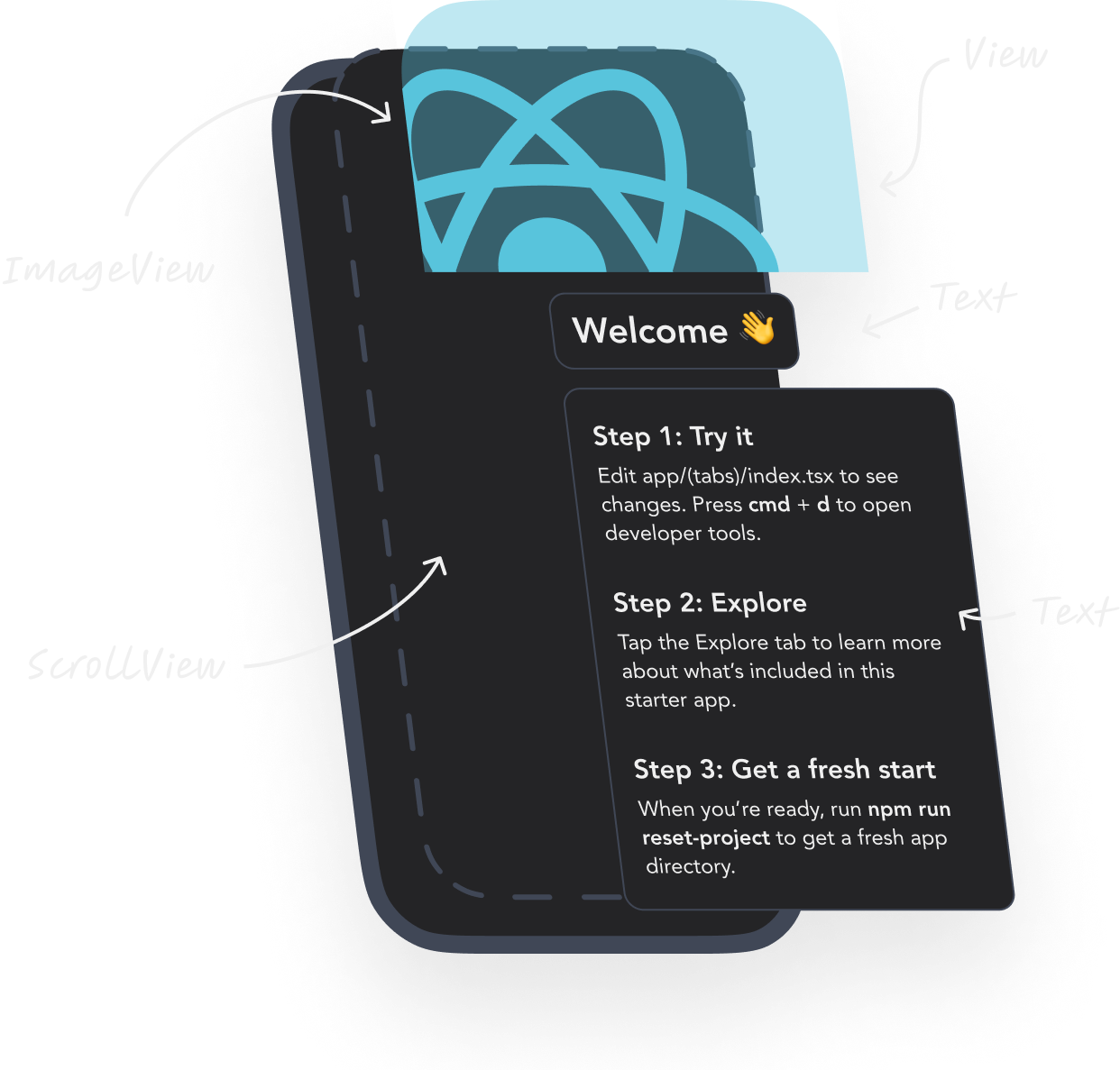
Main Components in Detail
View
- The
Viewcomponent in React Native is used as a container to group and arrange other components.- It is used to create layout constructs.
- It also has various props that can be used to customize its appearance and behavior.
- it is similar to the
divfrom web.
import React from 'react';
import { View } from 'react-native';

const AppView = () => {
  return (
    <View
      style={{
        backgroundColor: 'red',
        marginTop: 50,
        marginHorizontal: 20,
        padding: 10
      }}>
      <View
        style={{
          backgroundColor: 'green',
          flex: 1,
          alignItems: 'center',
          justifyContent: 'center'
        }}>
        <View style={{ backgroundColor: 'yellow', padding: 10 }}>
          <View style={{ backgroundColor: 'white', height: 50, width: 50 }} />
        </View>
      </View>
    </View>
  );
};

export default AppView;
Styling
- How it works?
- All the core components accept a prop named style.
- Create your styles using
Stylesheet.createand pass the styles to the style prop. - The style names and values usually match how CSS works on the web, except names are written using camel casing, e.g. backgroundColor rather than background-color.
- Tips:
- Move styles away from the render function, thus making the code easier to understand.
import React from 'react';
import {StyleSheet, Text, View} from 'react-native';

const LotsOfStyles = () => {
  return (
    <View style={styles.container}>
      <Text style={styles.red}>just red</Text>
      <Text style={styles.bigBlue}>just bigBlue</Text>

	  //you can pass array of styles
      <Text style={[styles.bigBlue, styles.red]}>bigBlue, then red</Text>
      <Text style={[styles.red, styles.bigBlue]}>red, then bigBlue</Text>
    </View>
  );
};

const styles = StyleSheet.create({
  container: {
    marginTop: 50,
  },
  bigBlue: {
    color: 'blue',
    fontWeight: 'bold',
    fontSize: 30,
  },
  red: {
    color: 'red',
  },
});

export default LotsOfStyles;
Shadow
- boxShadow
- boxShadow adds a shadow to an element, with the ability to control the position, color, size, and blurriness of the shadow.
- Similar to how boxShadow works in css
//in react version 0.76 and above
const styles = StyleSheet.create({
	card: {
		boxShadow: "5 5 5 0 rgba(255, 0, 0, 0.5)"
	}
})

//older react native versions
//tool for shadow generation:  https://ethercreative.github.io/react-native-shadow-generator
const styles = StyleSheet.create({
	card: {
		shadowColor: "#000",
		shadowOffset: {
			width: 0,
			height: 2,
		},
		shadowOpacity: 0.25,
		shadowRadius: 3.84,
		elevation: 5,
	}
})
Hairline Width
- This is defined as the width of a thin line on the platform.
- use-case:
- It can be used as the thickness of a border or division between two elements
const App = () => (
  <Button title="click me" onPress={} style={styles.btn}/>
);

const styles = StyleSheet.create({
  btn: {
    padding: 4,
    borderBottomColor: 'red',
    borderBottomWidth: StyleSheet.hairlineWidth,
  },
});
Layout
Flex Layout
- React native uses flex which is similar to css flex for styling.
- Layout with Flexbox · React Native
- Every component has display flex and its direction is
columnunlike web which row. - Check out the React native layout system to learn how styling works
- What does
{flex: 1}?- Setting an element to
flex: 1, i.e a container is a common practice that has a specific purpose in layout design.- Takes Up Available Space
- similar to
flex-grow
- similar to
- Relative Sizing
- If one element has
flex: 1and another hasflex: 2, the second element will take up twice as much space as the first.
- If one element has
- Takes Up Available Space
- Setting an element to
const App = () => {
  return (
    <View style={styles.container}>
      <View style={styles.box1}>
        <Text>Box 1</Text>
      </View>
      <View style={styles.box2}>
        <Text>Box 2</Text>
      </View>
    </View>
  );
};

const styles = StyleSheet.create({
  container: {
    flex: 1, // The container takes up the entire screen
    flexDirection: 'column', // Default, children are stacked vertically
  },
  box1: {
    flex: 1, // Takes up 1/3 of the container's height
    backgroundColor: 'lightblue',
    justifyContent: 'center',
    alignItems: 'center',
  },
  box2: {
    flex: 2, // Takes up 2/3 of the container's height
    backgroundColor: 'lightgreen',
    justifyContent: 'center',
    alignItems: 'center',
  },
});

export default App;
Position Layout
- Position layout such as
position: absoluteandposition: relativework just like how they are used web css.
const App = () => {
  return (
    <View style={styles.container}>
      {/* Relative Positioning */}
      <View style={styles.relativeBox}>
        <Text style={styles.text}>Relative Box</Text>
      </View>

      {/* Absolute Positioning */}
      <View style={styles.absoluteBox}>
        <Text style={styles.text}>Absolute Box</Text>
      </View>
    </View>
  );
};

const styles = StyleSheet.create({
  container: {
    flex: 1,
    backgroundColor: '#f5f5f5',
    justifyContent: 'center',
    alignItems: 'center',
  },
  relativeBox: {
    position: 'relative', // Default, can be omitted
    top: 20, // Moves the box 20 pixels down from its normal position
    left: 20, // Moves the box 20 pixels to the right from its normal position
    width: 150,
    height: 150,
    backgroundColor: 'lightblue',
    justifyContent: 'center',
    alignItems: 'center',
  },
  absoluteBox: {
    position: 'absolute',
    top: 50, // Places the box 50 pixels from the top of the parent container
    right: 50, // Places the box 50 pixels from the right of the parent container
    width: 100,
    height: 100,
    backgroundColor: 'lightgreen',
    justifyContent: 'center',
    alignItems: 'center',
  },
  text: {
    color: '#fff',
    fontSize: 16,
  },
});

export default App;
Do not forget to consider and use SafeAreaContext when placing an element at the edges of your app screen.
Use Percentage or Relative Units
- Unlike the web, you can’t use
vworvh, but you can simulate them:
import { Dimensions } from 'react-native';
const { width, height } = Dimensions.get('window');

const styles = StyleSheet.create({
  box: {
    width: width * 0.9,   // 90% of screen width
    height: height * 0.2, // 20% of screen height
  },
});
Text
- The
Textcomponent in React Native is used to display and style text on the screen. - It is a basic component that renders a string of text, which can be styled using various props.
- The most commonly used props are
style,numberOfLines, andellipsizeMode.
- The
styleprop is used to define the visual appearance of the text and other components.- It accepts an object containing various style properties such as
color,fontSize,fontWeight,textAlign,textDecorationLine,textShadowColor,textShadowOffset, andtextShadowRadius. With these style props, you can customize the text as per your need.
- It accepts an object containing various style properties such as
import React from 'react';
import { Text, View } from 'react-native';

const AppText = () => {
  return (
    <View>
      <Text style={{ color: 'blue', fontSize: 24 }}>This is a text component.</Text>
    </View>
  );
};

export default AppText;
- The
numberOfLinesprop determines the maximum number of lines of text that can be displayed. - The
ellipsizeModeprop specifies what to display at the end of the truncated text when the maximum number of lines is reached.- The following values are available for
ellipsizeMode:'head','middle', and'tail'.
- The following values are available for
import React from 'react';
import { Text, View } from 'react-native';

const AppText = () => {
  return (
    <View>
      <Text numberOfLines={1} ellipsizeMode="tail" style={{ color: 'red', fontSize: 36 }}>
        This is a very long text that will be truncated by the `numberOfLines` prop.
      </Text>
    </View>
  );
};

export default AppText;
Button
- A basic button component that should render nicely on any platform. Supports a minimal level of customization.
- underneath it uses
Pressablecomponent, which you can use to create custom buttons too
<Button
  onPress={onPressLearnMore}
  title="Learn More"
  color="#841584"
  accessibilityLabel="Learn more about this purple button"
/>

<Button
  onPress={onPressLearnMore}
  title="Learn More"
  color="#841584"
  accessibilityLabel="Learn more about this purple button"
  disabled={true}
/>
Image
- The
sourceprop of theImagecomponent is used to specify the image's location, either as a string or an object with auriattribute. - Here's an example:
import React from 'react';
import { Image, View } from 'react-native';

const ExampleApp = () => (
  <View>
    <Image
      source={{uri: 'https://picsum.photos/200/300'}} // specify the image location
      style={{width: 200, height: 300}} // specify the dimensions of the image
    />
  </View>
);

export default ExampleApp;
- The
Imagecomponent also has additional props that can be used to customize its appearance and behavior.- These include
onLoad,onError,resizeMethod,resizeMode,borderRadius,overlayColor, among others. defaultSource, A static image to display while loading the image source.
- These include
- Key points:
- Image missing width dimension for network URI
- React Native's
<Image>requires explicit width and height for remote images (to avoid layout thrashing or blank renders) - style with height and width value is preferred for consistency instead of using Images's width and height props
- ex: use
style={{ width: '100%', height: 300 }}.
- ex: use
- React Native's
- Image missing width dimension for network URI
<Image
  source={require('./image.png')}
  style={{width: 200, height: 300}}
  onLoad={() => console.log('Image loaded')}
  onError={() => console.log('Image failed to load')}
  resizeMode="cover"
  borderRadius={10}
  overlayColor="blue"
/>


//default source example
<Image
  source={{uri: 'https://picsum.photos/200/300'}}
  style={{width: 200, height: 300}}
  defaultSource={require('./loading.png')}
  resizeMode="cover"
  borderRadius={10}
  overlayColor="blue"
/>
If you are loading multiple images, ex: Image gallery with FlatList consider using more efficient Image component i.e Expo Image
Image Background
ImageBackgroundis a component that provides a way to display an image as a background to other components.- It has the same props as
Imageand accepts any children components. However, you must specify the width and height style attributes for this component. - Here is an example of usage of
ImageBackground:
import React from 'react';
import { ImageBackground, StyleSheet, Text, View } from 'react-native';

const image = { uri: 'https://reactjs.org/logo-og.png' };

const App = () => (
  <View style={styles.container}>
    <ImageBackground source={image} resizeMode="cover" style={styles.image}>
      <Text style={styles.text}>Inside</Text>
    </ImageBackground>
  </View>
);

const styles = StyleSheet.create({
  container: {
    flex: 1,
  },
  image: {
    flex: 1,
    justifyContent: 'center',
  },
  text: {
    color: 'white',
    fontSize: 42,
    lineHeight: 84,
    fontWeight: 'bold',
    textAlign: 'center',
    backgroundColor: '#000000c0',
  },
});

export default App;
TextInput
- The
TextInputcomponent in React Native provides a way for the user to enter text. - The component has various props that can be used to customize its behavior and appearance.
- Below are some prop explanations and code examples to help you understand how to use this component:
onChangeText
- This prop takes a function that will be called every time the text is changed. It provides the new text as an argument.
- This is useful for updating state and performing other tasks as the user types.
import React, { useState } from 'react';
import { TextInput, View } from 'react-native';

const ExampleApp = () => {
  const [text, setText] = useState('');

  const handleTextChanged = (newText) => {
    setText(newText);
  };

  return (
    <View>
      <TextInput
        value={text}
        onChangeText={handleTextChanged}
        placeholder="Enter some text"
      />
    </View>
  );
};

export default ExampleApp;
onSubmitEditing
- This prop takes a function that will be called when the user submits the text input. This can be useful for handling form submissions or performing some other action when the user is finished entering text.
import React from 'react';
import { Alert, TextInput, View } from 'react-native';

const ExampleApp = () => {
  const handleSubmit = () => {
    Alert.alert('Text submitted!');
  };

  return (
    <View>
      <TextInput
        onSubmitEditing={handleSubmit}
        placeholder="Enter some text and submit"
      />
    </View>
  );
};

export default ExampleApp;
secureTextEntry
- This prop can be set to
trueto hide the text input and show it as a password field.- This is useful for password and other sensitive data entry.
import React, { useState } from 'react';
import { TextInput, View } from 'react-native';

const ExampleApp = () => {
  const [password, setPassword] = useState('');

  const handlePasswordChanged = (newPassword) => {
    setPassword(newPassword);
  };

  return (
    <View>
      <TextInput
        value={password}
        onChangeText={handlePasswordChanged}
        placeholder="Enter your password"
        secureTextEntry={true}
      />
    </View>
  );
};

export default ExampleApp;
Pressable
Pressableis a React Native component that allows a touchable area on the screen to be detected and responds by calling the specified- onPress,
- onPressIn, or onPressOut callbacks, and
- here's an example:
import React from 'react';
import { StyleSheet, Text, Pressable } from 'react-native';

const App = () => {
  const onPressInHandler = () => {
    console.log('Button is pressed in');
  };

  const onPressOutHandler = () => {
    console.log('Button is pressed out');
  };

  const onPressHandler = () => {
    console.log('Button is pressed');
  };

  return (
    <Pressable
      onPressIn={onPressInHandler}
      onPressOut={onPressOutHandler}
      onPress={onPressHandler}
    >
      {({ pressed }) => (
        <Text style={[styles.button, pressed && styles.buttonPressed]}>
          Pressable
        </Text>
      )}
    </Pressable>
  );
};

export default App;
There is similar component called
TouchableOpacity, butPressableis more extensive and future-proof way to handle touch-based input
ActivityIndicator
ActivityIndicatorcomponent in React Native is a circular indicator that is used to show that some action is being performed.- You can see this component often in cases like loading the page or loading some data.
- Here's an example of how to use the
ActivityIndicatorcomponent in React Native.
import React from 'react';
import { View, ActivityIndicator, StyleSheet } from 'react-native';

const Loader = () => {
  return (
    <View style={styles.container}>
      <ActivityIndicator size="large" color="#0000ff" />
    </View>
  );
};

const styles = StyleSheet.create({
  container: {
    flex: 1,
    justifyContent: 'center',
    alignItems: 'center',
  },
});

export default Loader;
ScrollView
ScrollViewis another pre-built React Native component that allows you to create scrollable content.- It's used to make lengthy content accessible by scrolling, either vertically or horizontally.
- Here's an example of how to use the
ScrollViewcomponent in React Native:
import React from 'react';
import { ScrollView, Text, Image } from 'react-native';

const logo = {
  uri: 'https://reactnative.dev/img/tiny_logo.png',
  width: 64,
  height: 64,
};

const ScrollViewComponent = () => {
  return (
    <ScrollView>
      <Text style={{fontSize: 96}}>Scroll me plz</Text>
      <Image source={logo} />
      <Image source={logo} />
      <Image source={logo} />
      <Text style={{fontSize: 96}}>If you like, </Text>
      <Image source={logo} />
      <Image source={logo} />
      <Image source={logo} />
      <Text style={{fontSize: 96}}>Scrolling down</Text>
      <Image source={logo} />
      <Image source={logo} />
      <Image source={logo} />
      <Text style={{fontSize: 96}}>What's the best</Text>
      <Image source={logo} />
      <Image source={logo} />
      <Image source={logo} />
      <Text style={{fontSize: 96}}>Framework around?</Text>
      <Image source={logo} />
      <Image source={logo} />
      <Image source={logo} />
      <Text style={{fontSize: 80}}>React Native</Text>
    </ScrollView>
  );
};

export default ScrollViewComponent;
- The
ScrollViewcomponent has a variety of props for customizing its behavior, such ascontentContainerStyle,onContentSizeChange, andsnapToAlignment. Additionally, you can usescrollTo()to move to a particular point in theScrollView, orscrollToEnd()to scroll to the end.
It should be noted that while
ScrollViewis a great option for small chunks of content, it is not suitable for large lists of data since it renders all the items concurrently, leading to sluggish performance. In such cases, it is recommended to use theFlatListcomponent instead.
FlatList
FlatListis a pre-built React Native component that provides an efficient way to render and display a large list of data.- It has features like lazy loading, scroll loading, and the ability to render different types of data inputs.
- FlatList inherits its base props from ScrollView
- Here's an example of how to use the
FlatListcomponent in React Native:
import React from 'react';
import { FlatList, Text } from 'react-native';

//It is a good practice to put your renderItem outside the component
//helps you avoid using useCallback
const renderFlatListItem = ({ item }) => {
	return (
	  <Text>{item.title}</Text>
	);
};

const FlatListComponent = () => {

  const data = [
    { key: '1', title: 'Item 1' },
    { key: '2', title: 'Item 2' },
    { key: '3', title: 'Item 3' },
    { key: '4', title: 'Item 4' },
    { key: '5', title: 'Item 5' }
  ];

  return (
    <FlatList
      data={data}
      renderItem={renderFlatListItem}
      keyExtractor={(item) => item.key()}
    />
  );
};

export default FlatListComponent;
- The
FlatListcomponent also provides some useful methods,- such as
scrollToItem, andscrollToOffset, which allows you to programmatically scroll the list to a particular item or position. onEndReached, which can be used to implement paginationListHeaderComponent&ListFooterComponnet, which can be used to create custom header and footer around ListkeyboardDissMissMode, Determines whether the keyboard gets dismissed in response to a drag.- set
keyboardDissMissMode = "on-drag"then keyboard is dismissed when a drag begins.
- set
- such as
- Key points
- FlatList lacks a bounded height (won't fill screen or scroll)
- FlatList requires a constrained height to virtualize items and enable scrolling.
- FlatList's default style is
{} (flex: 0), so it collapses to content height (potentially rendering everything at once, causing perf issues or no scroll). - Consider adding
style={{ flex: 1 }}to FlatList. This makes it expand to fill the parent.
- Missing keyExtractor on FlatList
- "Each child in a list should have a unique 'key' prop." Without it, re-renders can be inefficient (e.g., during updates)
- Add
keyExtractor={(item) => item.id.toString()}. If no id, use index (less ideal):keyExtractor={(item, index) => index.toString()}.
- FlatList lacks a bounded height (won't fill screen or scroll)
- FlatList alternatives
- SectionList · React Native
- FlashList by Shopify, Similar to FlatList with better performance and similar api compatibility
- LegendApp/legend-list
Safe Area Context
Not to be confused with
SafeAreaViewfrom React native, that only works onios
- An external library with a flexible API for accessing the device's safe area inset information.
import { SafeAreaView } from 'react-native-safe-area-context';

function SomeComponent() {
  return (
    <SafeAreaView>
      <View />
    </SafeAreaView>
  );
}
- useSafeAreaInsets
- Hook gives you direct access to the safe area insets. This can be useful when you want to place element(i.e. Header) to safe area by setting styles like
paddingTop.
- Hook gives you direct access to the safe area insets. This can be useful when you want to place element(i.e. Header) to safe area by setting styles like
import { useSafeAreaInsets } from 'react-native-safe-area-context';

function HookComponent() {
  const insets = useSafeAreaInsets();

  return <View style={{ paddingTop: insets.top }} />;
}

//example two
import { useSafeAreaInsets } from 'react-native-safe-area-context';

function HookComponent() {
  const insets = useSafeAreaInsets();

  return <View style={{ position: "absolute", bottom: insets.bottom }} />;
}
Use Case Examples
Pull-to-refresh
- To implement pull to refresh functionality in a
FlatListcomponent in React Native, you can make use of theRefreshControlcomponent provided by React Native. - Here's an example code snippet:
import React, { useState, useCallback } from 'react';
import { FlatList, RefreshControl, StyleSheet, Text, View } from 'react-native';

const DATA = [
  { id: '1', title: 'Item 1' },
  { id: '2', title: 'Item 2' },
  { id: '3', title: 'Item 3' },
  { id: '4', title: 'Item 4' },
  { id: '5', title: 'Item 5' },
];

const App = () => {
  const [refreshing, setRefreshing] = useState(false);

  const onRefresh = useCallback(() => {
    setRefreshing(true);
    setTimeout(() => {
      setRefreshing(false);
    }, 2000);
  }, []);

  const renderItem = ({ item }) => (
    <View style={styles.item}>
      <Text style={styles.title}>{item.title}</Text>
    </View>
  );

  return (
    <View style={styles.container}>
      <FlatList
        data={DATA}
        renderItem={renderItem}
        keyExtractor={(item) => item.id}
        refreshControl={
          <RefreshControl refreshing={refreshing} onRefresh={onRefresh} />
        }
      />
    </View>
  );
};

const styles = StyleSheet.create({
  container: {
    flex: 1,
    padding: 24,
  },
  item: {
    backgroundColor: '#f9c2ff',
    padding: 20,
    marginVertical: 8,
    marginHorizontal: 16,
  },
  title: {
    fontSize: 32,
  },
});

export default App;
Scroll to item/index
- To scroll to a specific index or item in a
FlatListin React Native, you can use thescrollToIndexorscrollToItemmethod respectively. Here is an example:
import React, { useRef } from 'react';
import { FlatList, StyleSheet, Text, View, Button } from 'react-native';

const DATA = [
  { id: '1', title: 'Item 1' },
  { id: '2', title: 'Item 2' },
  { id: '3', title: 'Item 3' },
  { id: '4', title: 'Item 4' },
  { id: '5', title: 'Item 5' },
  { id: '6', title: 'Item 6' },
  { id: '7', title: 'Item 7' },
  { id: '8', title: 'Item 8' },
];

const App = () => {
  const flatListRef = useRef(null);

  const scrollToIndex = () => {
    flatListRef.current.scrollToIndex({ index: 4 });
  };

  const scrollToItem = () => {
    flatListRef.current.scrollToItem({
      item: { id: '3', title: 'Item 3' },
    });
  };

  const renderItem = ({ item }) => (
    <View style={styles.item}>
      <Text style={styles.title}>{item.title}</Text>
    </View>
  );

  return (
    <View style={styles.container}>
      <Button title="Scroll to Index" onPress={scrollToIndex} />
      <Button title="Scroll to Item" onPress={scrollToItem} />
      <FlatList
        ref={flatListRef}
        data={DATA}
        renderItem={renderItem}
        keyExtractor={(item) => item.id}
      />
    </View>
  );
};

const styles = StyleSheet.create({
  container: {
    flex: 1,
    padding: 24,
  },
  item: {
    backgroundColor: '#f9c2ff',
    padding: 20,
    marginVertical: 8,
    marginHorizontal: 16,
  },
  title: {
    fontSize: 32,
  },
});

export default App;
Platform Specific Codes
- Platform · React Native
- When building a cross-platform app, you'll want to re-use as much code as possible. However, Scenarios may arise where it makes sense for the code to be different, for example you may want to implement separate visual components for Android and iOS.
import {Platform, StyleSheet} from 'react-native';

const styles = StyleSheet.create({
  height: Platform.OS === 'ios' ? 200 : 100,
});
import {Platform, StyleSheet} from 'react-native';

const styles = StyleSheet.create({
  container: {
    flex: 1,
    ...Platform.select({
      ios: {
        backgroundColor: 'red',
      },
      android: {
        backgroundColor: 'green',
      },
      default: {
        // other platforms, web for example
        backgroundColor: 'blue',
      },
    }),
  },
});
- This will result in a container having flex: 1 on all platforms, a red background color on iOS, a green background color on Android, and a blue background color on other platforms.
- Since it accepts any value, you can also use it to return platform-specific components, like below:
const Component = Platform.select({
  ios: () => require('ComponentIOS'),
  android: () => require('ComponentAndroid'),
})();

<Component />;
- You can also use Platform to check which version of android or ios your app is running
- When your platform-specific code is more complex, you should consider splitting the code out into separate files. React Native will detect when a file has a .ios. or .android. extension and load the relevant platform file when required from other components.
BigButton.ios.js
BigButton.android.js

import BigButton from './BigButton';

//result => React Native will automatically pick up the right file based on the running platform.
Local storage/shared Preferences
- There are mainly three libraries to do this with
Async Storage- Provides an asynchronous, unencrypted, key-value store.
- Async Storage is not shared between apps: every app has its own sandbox environment and has no access to data from other apps.
- Guidelines
- Use Async storage to store non sensitive data
- i.e user preferences,
- Don't use Async storage to store tokens and secrets
- Use Async storage to store non sensitive data
- Expo secure store
- Use it to store sensitive info like tokens and secrets
- MMKV
- mrousavy/react-native-mmkv: ⚡️ The fastest key/value storage for React Native. ~30x faster than AsyncStorage!
- Has significant performance advantage compared to other local key value storage options.
- includes secure storage for sensitive data.
Use DOM
- Using React DOM in Expo native apps - Expo Documentation
- While your goal should be to develop your app entrily native, there might be cases where you want to use existing react components in your app, such cases could
- reuse existing complex web component for the sake for
mvp - your desired component is not currently available natively
- use rich text components, markdown and webGL support which are greatly supported on web
- reuse existing complex web component for the sake for
- how to use?
- add the
use domdirective to the top of the web component file to include a React component.
- add the
- examples
'use dom';

export default function DOMComponent({ name }: { name: string }) {
  return (
    <div>
      <h1>Hello, {name}</h1>
    </div>
  );
}


//inside your app.sj
import DOMComponent from './my-component.tsx';

export default function App() {
  return (
    // This is a DOM component. It re-exports a wrapped `react-native-webview` behind the scenes.
    <DOMComponent name="Europa" />
  );
}
- you can pass props to the
domcomponent
'use dom';

export default function DOMComponent({ hello }: { hello: string }) {
  return <p>Hello, {hello}</p>;
}


import DOMComponent from './my-component';

export default function App() {
  return <DOMComponent hello={'world'} />;
}
- you can pass native functions as props to the
domcomponent- be aware
- You cannot pass functions as nested props to DOM components. They must be top-level props.
- If you want to pass
domconfigurations as props, use the specialdompropsDOMComponent({}: { dom: import('expo/dom').DOMProps })- Read more
- for navigation, you can use the
<Link/>component from React router. however if you want other functionality from React router i.e. pathname you need to pass it as a prop.
- be aware
'use dom';

export default function MyComponent({ hello }: { hello: (data: string) => Promise<void> }) {
  return <p onClick={() => hello('world')}>Click me</p>;
}


import DomComponent from './my-component';

export default function App() {
  return (
    <DomComponent
      hello={(data: string) => {
        console.log('Hello', data);
        //or call native apis such as notification, faceID...
      }}
    />
  );
}
Performance Improvements
- Source:
- What tools to use to inspect performance degrades
- Use Chrome DevTools for React native
- Just press J in Expo CLI to open Chrome DevTools and connect it directly to the Hermes engine.
- Example:
- One of the features for optimizing performance is the ability to highlight React renders. This tool is essentially equivalent to React Scan.
Go to: Profiler > [Gear icon] > “Highlight updates when components render.
- Use Chrome DevTools for React native
- Leverage features from React toolbox
- Use React Compiler
- For many cases this reduces the need for using react memoization features but for specific and rare cases you might still need, useMemo, React.memo and useCallback hooks…
- Load components or data only when needed (e.g., using
React.lazyor pagination).- Lazy components great options when dealing with Heavy components i.e Map Components
- Consider Concurrent React features to prioritize high priority updates
- Background tasks, offload heavy computational tasks to background thread.
- Use React Compiler
- Build your UI as a list first
- Strategy:
- Use FlatList of FlashList to build your ui
- Replace ScrollView or list of items with Recyclable Views
- ScrollView ends up drawing all the items while FlatList without a custom config only draws 10 items.
- Benefit:
- Only renders what's visible and updates only the necessary components.
- Strategy:
- Leverage Caching Effectively
- Strategy:
- Load data from a cache first, then fetch updates from the network in parallel.
- Benefit:
- Improves perceived loading times, especially for users who frequently access the app.
- Strategy:
- Find and use better library
- Beyond common libraries, consider and evaluate new and alternative libraries based on performance and features.
- Remove
console.logfrom output builds- Not just removing from your project, add a babel-plugin-transform-remove-console · Babel to remove console.log from third party plugins as well.
Popular Libraries to Know
Most Common
| Category | Library Name | Description/Link |
|---|---|---|
| Data Fetching | TanStack Query (React Query) | For both REST & GraphQL. |
| Fetch API | Built-in browser API for making network requests. | |
| State Management | TanStack Query (React Query) | Can also be used for managing server state. |
| Zustand | A small, fast, and scalable bearbones state-management solution. Zustand documentation | |
| useContext, useReducer | React's built-in hooks for state management. | |
| Navigation | Expo Router | File-based routing for React Native & web. Introduction - Expo Documentation |
| React Navigation | A popular community solution for navigation. | |
| Styling UI | NativeWind | Tailwind CSS for React Native. Uniwindor NativeWind |
| StyleSheet API | React Native's built-in API for styling. | |
| UI Libraries | React Native Paper | Material Design components for React Native. React Native Paper |
| Internationalization | react-i18next | A powerful internationalization framework for React. |
| Testing | Jest | A delightful JavaScript Testing Framework with a focus on simplicity. |
| Animation | React Native Gesture Handler | Declarative API exposing platform native touch and gesture system. Introduction |
| React Native Reanimated | React Native's Animated library reimplemented. Getting started |
Others
| Category | Library Name | Description/Link |
|---|---|---|
| Native Menu | Zeego | Beautiful, native menus for React Native + Web. Welcome to Zeego |
| Local Database | Expo SQLite | Provides an API for a WebSQL-compatible database. Can integrate with Drizzle ORM. Drizzle ORM for React Native |
| Chart Library | Victory Native | A collection of composable React components for building interactive data visualizations. Victory Native |
| Maps | react-native-maps | React Native Map components for iOS (Apple Maps) & Android (Google Maps). react-native-maps - npm |
| Mapbox (@rnmapbox/maps) | React Native Mapbox SDK. React Native Mapbox | |
| BottomSheet | React Native Bottom Sheet by Gorhom | React Native Bottom Sheet - Gorhom |
| React Native True Sheet | True Native Bottom Sheet | |
| Payment/Subs | RevenueCat | In-app subscriptions made easy. |
| Toast | sonner-native | An opinionated toast component for React Native. |
| SVG | react-native-svg | SVG library for React Native, React Native Web, and plain React web projects. react-native-svg GitHub |
| Blur Effect | BlurView (Expo) | A React component that blurs everything underneath the view. BlurView - Expo Docs |
| react-native-blurhash | Show colorful blurry placeholders while content loads. react-native-blurhash GitHub | |
| Share | Share (from React Native) | For simple text-based sharing. Share · React Native |
| react-native-share | For sharing with options like URI, images, and files. react-native-share GitHub | |
| Alert & Prompts | Alert (from React Native) | Launches an alert dialog. Prompt feature is iOS only. Alert · React Native |
| react-native-prompt-android | External library for prompt support on both Android and iOS. react-native-prompt-android - npm | |
| Quick Actions | expo-quick-actions | Add home screen quick actions/shortcuts. expo-quick-actions GitHub |
| Keyboard handling | react-native-keyboard-controller | GitHub - kirillzyusko/react-native-keyboard-controller: ⌨️ Keyboard manager which works in identical way on both iOS and Android |